Profvis — Interactive Visualizations for Profiling R Code
Overview

Profvis is a tool for helping you to understand how R spends its time. It provides a interactive graphical interface for visualizing data from Rprof, R’s built-in tool for collecting profiling data.
Most R users have had times where we’ve wanted our code to run faster. However, it’s not always clear how to accomplish this. A common approach is to rely on intuition, and on wisdom from the broader R community about speeding up R code. One drawback to this is it can lead to a focus on optimizing things that actually take a small proportion of the overall running time.
Suppose you make a loop run 5 times faster. That sounds like a huge improvement, but if that loop only takes 10% of the total time, it’s still only a 8% speedup overall. Another drawback is that, although many of the commonly-held beliefs are true (for example, preallocating memory can speed things up), some are not (e.g., that *apply functions are inherently faster than for loops). This can lead us to spend time doing “optimizations” that don’t really help. To make slow code faster, we need accurate information about what is making our code slow.
Getting started
To install profvis from CRAN:
install.packages("profvis")The RStudio IDE includes integrated support for profiling with profvis. These features are available in the current Preview Release of RStudio.
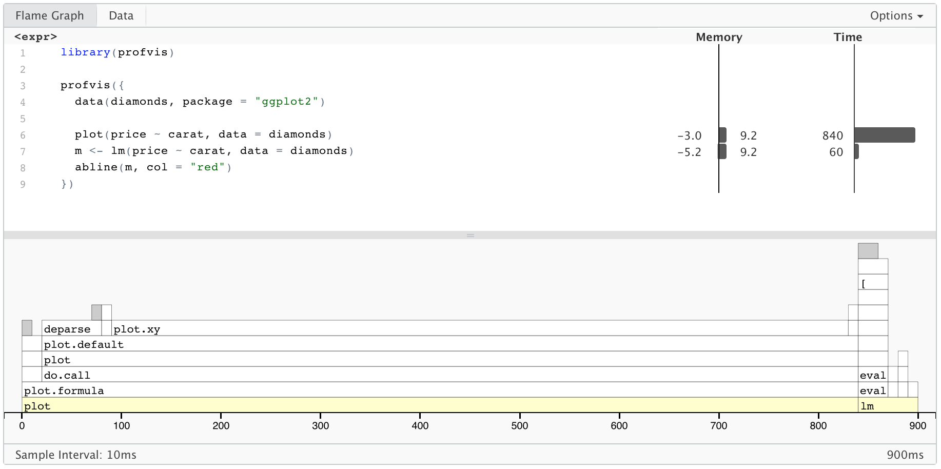
Below is an example of profvis in use. The code creates a scatter plot of the diamonds data set, which has about 54,000 rows, fits a linear model, and draws a line for the model. (The plot isn’t displayed in this document, though.) If you copy and paste this code into your R console, it’ll open a window with the same profvis interface that you see in this HTML document.
library(profvis)

profvis({
  data(diamonds, package = "ggplot2")

  plot(price ~ carat, data = diamonds)
  m <- lm(price ~ carat, data = diamonds)
  abline(m, col = "red")
})
On top is the code, and on the bottom is a flame graph. In the flame graph, the horizontal direction represents time in milliseconds, and the vertical direction represents the call stack. Looking at the bottom-most items on the stack, most of the time, about 2 seconds, is spent in plot, and then a much smaller amount of time is spent in lm, and almost no time at all is spent in abline – it doesn’t even show up on the flame graph.
Traveling up the stack, plot called plot.formula, which called do.call, and so on. Going up a few more levels, we can see that plot.default called a number of functions: first deparse, and later, plot.xy. Similarly, lm calls a number of different functions.
On top, we can see the amount of time spent on each line of code. This tells us, unsurprisingly, that most of the time is spent on the line with plot, and a little bit is spent on the line with lm.
The code panel also shows memory allocation and deallocation. Interpreting this information can be a little tricky, because it does not necessarily reflect memory allocated and deallcated at that line of code. The sampling profiler records information about memory allocations that happen between the previous sample and the current one. This means that the allocation/deallocation values on that line may have actually occurred in a previous line of code.
The data view
In addition to the flame graph view, profvis provides a data view, which can be seen by clicking on the Data tab. It provides a top-down tabular view of the profile. Click the code column to expand the call stack under investigation and the following columns to reason about resource allocation:
- Memory: Memory allocated or deallocated (for negative numbers) for a given call stack. This is represented in megabytes and aggregated over all the call stacks over the code in the given row.
- Time: Time spent in milliseconds. This field is also aggregated over all the call stacks executed over the code in the given row.
How profiling data is collected
Profvis uses data collected by Rprof, which is part of the base R distribution. At each time interval (profvis uses a default interval of 10ms), the profiler stops the R interpreter, looks at the current function call stack, and records it to a file. Because it works by sampling, the result isn’t deterministic. Each time you profile your code, the result will be slightly different.